Simiot - Responsive HAML+LESS Theme
This theme is based upon Twitter Bootstrap. We made sure we've exploited all of its potential, making it easy for you to get whatever you need, with minimal effort and modifications. We also kept all of its conventions; we knew it would've been more fun for you to do things, rather than learning a new logic.
View the video
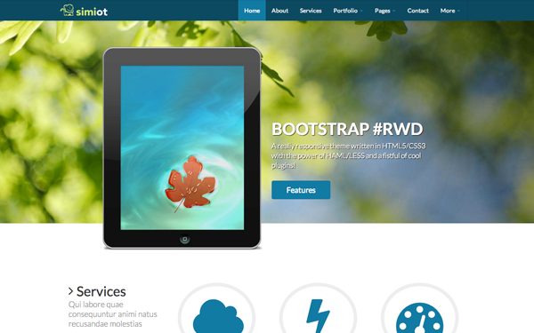
FEATURES
A really responsive theme written in HTML5/CSS3 with the power of HAML/LESS and a fistful of cool plugins!
HTML5 + CSS3
We wrote this theme using clear and simple HTML5 and CSS3 syntaxes. Resulting code is valid, properly indented and well commented.
HAML + LESS
We wrote the HTML code for this theme using HAML, a template language which simplifies and speeds markup creation.
Don't worry, though; you don't need to know anything about it. HTML files are ready to use.
The CSS of this theme is written using LESS, a preprocessor which allows to exploit all of Bootstrap potential.
Of course, it's not mandatory that you also use LESS - although we strongly recommended it; you can achieve whatever you need by simply editing our clear CSS code.
Responsive
When you change window's width, Bootstrap automatically adapts columns' width and placement, possibly by means of serialization. This template does this and more for you.
When you vary the width and height of the window, we also modify the font-size, so that all spaces are filled with text snippets and images, always achieving visually appealing layouts.
Font Awesome
Why using rastered images when we can exploit powerful font icons? Font Awesome is the best solution to combine with Twitter Bootstrap.
It's easy to integrate and use, and you don't need to know anything more than what you already know!
FitVids
A theme can not be considered responsive if all of its content does not resize properly, depending on the device on which it is displayed. That's why we have chosen FitVids, a simple, lightweight jQuery plugin which allows for fluid videos to be displayed.
Nothing could be simpler...
FlexSlider
FlexSlider is the best responsive slider. Period. It's easy to use and ready for responsive design, the best solution for sites requiring the maximum degree of compatibility with desktop and mobile devices.
Masonry
Masonry is a dynamic layout plugin for jQuery. The flip-side of CSS floats.
When you need to align a series of boxes there is no better solution than this. It's easy to use and offers an high degree of compatibility with older browsers.
If you're wondering what would happen if the same content had been displayed without this plugin ...take a look here!
Isotope
If you need to filter content via Javascript Isotope is the perfect solution. As you can see in this example, the plugin has been optimized to run well at any resolution without sacrificing aesthetics and performance.
Hoverdir
Direction-Aware Hover Effect. A nice effect to use in a gallery. Fully customizable and easy to integrate into any page.
Fancybox
FancyBox offers a nice and elegant way to add zooming functionality for images, html content and multi-media on your webpages. It is built on the top of the popular JavaScript framework jQuery and it is both easy to implement and customize.
Simply add the class "fancybox" to a link and magic happens!
You May Also Like