RESIE - Responsive Vertical Navigation
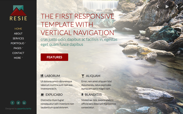
The first responsive business template with VERTICAL NAVIGATION
This theme is based upon Twitter Bootstrap. We made sure we've exploited all of its potential, making it easy for you to get whatever you need, with minimal effort and modifications. We also kept all of its conventions; we knew it would've been more fun for you to do things, rather than learning a new logic.
View also Simiot | Responsive HAML+LESS Theme
Features
HTML5 + CSS3
We wrote this theme using clear and simple HTML5 and CSS3 syntaxes. Resulting code is valid, properly indented and well commented.
LESS
The CSS of this theme is written using LESS, a preprocessor which allows to exploit all of Bootstrap potential. Of course, it's not mandatory that you also use LESS - although we strongly recommended it; you can achieve whatever you need by simply editing our clear CSS code.
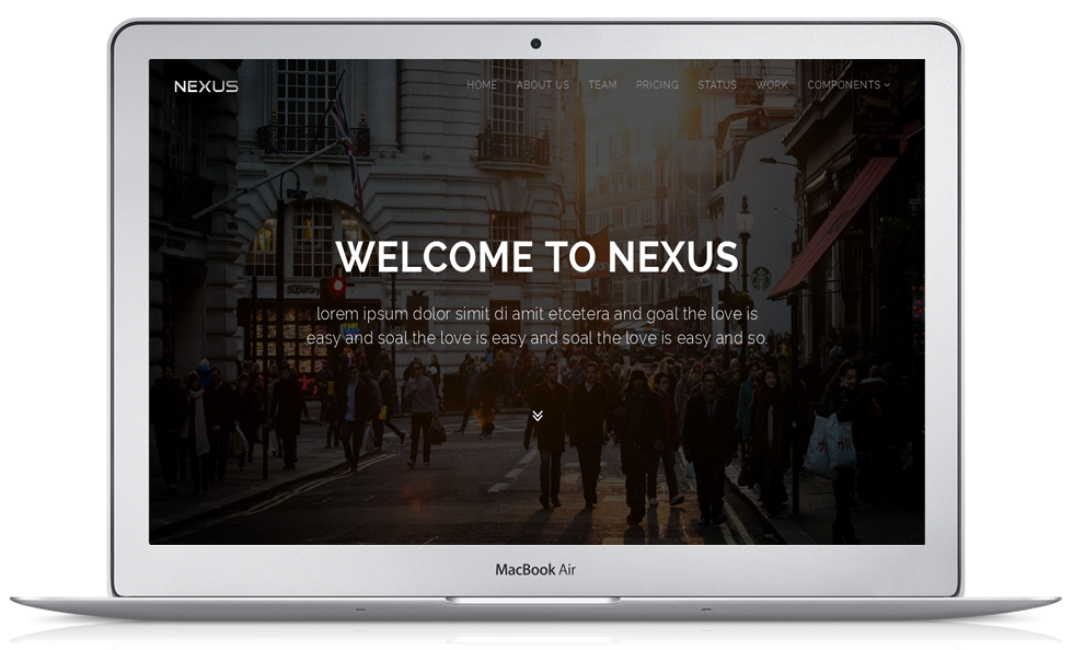
Responsive
When you change window's width, Bootstrap automatically adapts columns' width and placement, possibly by means of serialization. This template does this and more for you.
When you vary the width and height of the window, we also modify the font-size, so that all spaces are filled with text snippets and images, always achieving visually appealing layouts.
Font Awesome
Why using rastered images when we can exploit powerful font icons? Font Awesome is the best solution to combine with Twitter Bootstrap.
It's easy to integrate and use, and you don't need to know anything more than what you already know!
Background Slideshow
We integrated a simple fullscreen background slideshow with auto-play and controls to navigate and pause. Thanks to Codrops
FitVids
A theme can not be considered responsive if all of its content does not resize properly, depending on the device on which it is displayed. That's why we have chosen FitVids, a simple, lightweight jQuery plugin which allows for fluid videos to be displayed.
Nothing could be simpler...
FlexSlider
FlexSlider is the best responsive slider. Period. It's easy to use and ready for responsive design, the best solution for sites requiring the maximum degree of compatibility with desktop and mobile devices.
Masonry
Masonry is a dynamic layout plugin for jQuery. The flip-side of CSS floats.
When you need to align a series of boxes there is no better solution than this. It's easy to use and offers an high degree of compatibility with older browsers.
If you're wondering what would happen if the same content had been displayed without this plugin ...take a look here!
Isotope
If you need to filter content via Javascript Isotope is the perfect solution. As you can see in this example, the plugin has been optimized to run well at any resolution without sacrificing aesthetics and performance.
Hoverdir
Direction-Aware Hover Effect. A nice effect to use in a gallery. Fully customizable and easy to integrate into any page.
Fancybox
FancyBox offers a nice and elegant way to add zooming functionality for images, html content and multi-media on your webpages. It is built on the top of the popular JavaScript framework jQuery and it is both easy to implement and customize.
Simply add the class "fancybox" to a link and magic happens!
Credits
images
500px.com/photo/27704981
500px.com/photo/26703061
500px.com/photo/27231339
500px.com/photo/21898171
500px.com/photo/32968667
500px.com/photo/25003225
500px.com/photo/29865839
500px.com/photo/25629985
500px.com/photo/25728739
500px.com/photo/30628057
500px.com/photo/25675175
500px.com/photo/29788937
500px.com/photo/29052013
500px.com/photo/26217777
500px.com/photo/23050215
500px.com/photo/20172085
logo
logoinstant.com
You May Also Like