When visitors land on a new website they usually have no idea where to begin. They usually just look around for navigation links that might provide the info they’re looking for. But the newest trend of the “start here” page offers a much better experience.
Brand new users on your site should be inspired to keep browsing deeper into your posts. The best way to achieve this is with a single unified intro page featuring links, a small guide to the site, and even some background about yourself & the site’s history.
In this post I’ll look into the trend of start here pages to see what they offer and how you can take advantage of them in your own projects.
Introduce Your Website
The biggest reason to use a “start here” page is to introduce new visitors to your website. Since each site offers something different the “start here” pages will have a different goal based on content.
Your page should share vital information and aim to educate visitors about the site. But it should also drive visitors further into the site by sharing the best resources and links to get started.
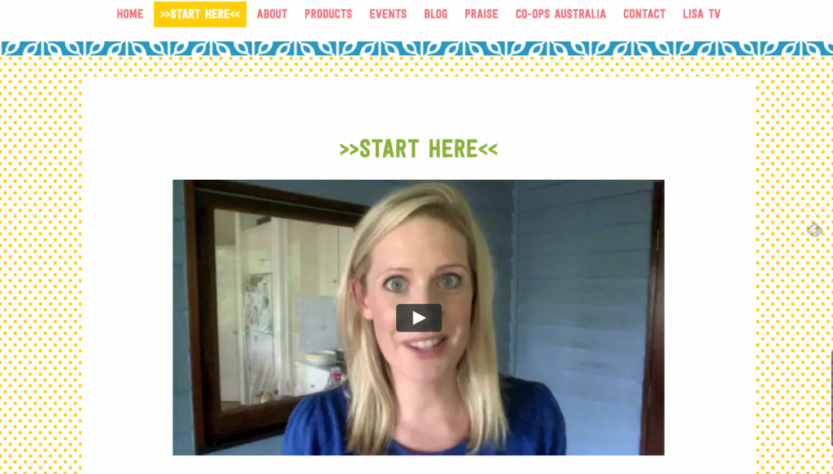
Personal blogs run by one person could have a “start here” page that introduces the person and their history with the website. This is the case with Darren Rowse on his site ProBlogger.
This is actually one of the more well-designed examples because Darren has years of experience with writing, design, and user conversions.
He offers a bunch of links to relevant posts right off the bat. He also has an embedded intro video for new visitors who want to learn more about the site. Down lower on the page you can read about Darren’s journey and how he built ProBlogger into the empire it is today.
By starting with a personal touch readers can be enticed to keep browsing further into the site. The page is full of CTAs for Darren’s newsletter and free e-book which may garner more clicks from people who now understand the mission behind ProBlogger.
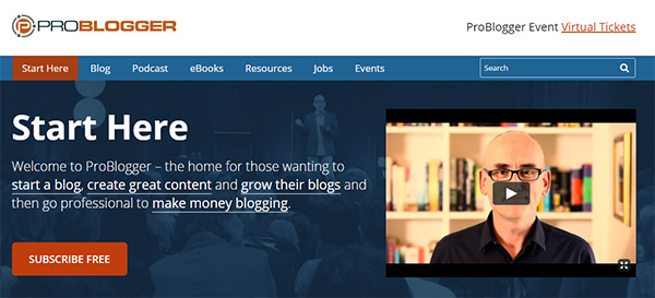
For a much simpler example check out the Modest Man page. This features a large fullsize photo of the site’s owner Brock McGoff. But most of the page centers around the value add from Modest Man as a website, not around Brock’s personality.
You can introduce a site however you want in whatever manner feels right. If you prefer to stay behind the scenes that’s totally OK.
Just understand that the goal is to educate and encourage visitors to keep clicking deeper into the site. Your start here page should answer common questions for newer users and help guide them further.
Make A Personal Connection
I briefly touched upon this idea earlier but I do recommend using a start here page on personal sites. These seem to work better for high-traffic sites where new visitors might not know about your or what you do.
But the goal with a personal page is to introduce yourself, your history, what you do and why you do it. Some people feel comfortable sharing their hobbies or family life while others keep it strictly business. There is no wrong answer.
The goal is to establish a personal connection with your visitors, or at least a semi-personal connection since it’s happening through a computer screen.
One of my favorite marketers is Gary Vaynerchuk and he has an incredible start here page on his personal site.
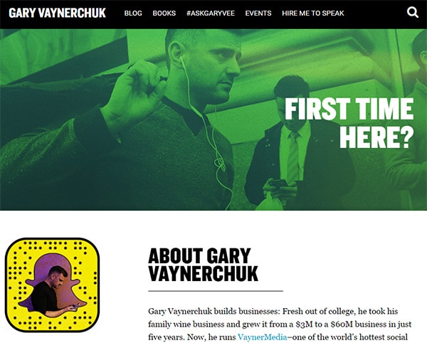
Since he does a lot of speaking and social media outreach most people already know who he is.
But it’s not fair to assume that everyone knows. So his start here page targets people who just want to learn more about Gary’s lifestyle. He shares info about his past and his business-building lifestyle.
Even more importantly he links out to all his social channels and links to some of the best articles on his site.
This is a good example of a personal value add where people can learn more about Gary and maybe even become followers of his work online.
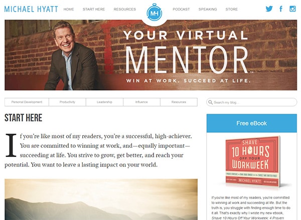
On the other hand you can do something like Michael Hyatt or Chris Ducker where they both offer specific tips and handy resources for new readers.
These pages introduce the person behind the site, but they put more focus on valuable information for the reader. If you’re running a personal site chances are that you offer something of value whether a product, service, or both.
Use your “start here” page to share your personal history but also to prove that you’re an authority in your industry.
List Important Articles
Sites with 100+ pages are much harder to search through even with category archives. Your best posts often get lost in the shuffle so you should do your best to include these links in your start here page.
New visitors won’t know where to start on your site or which posts are worth reading. Create lists of your best articles and encourage new visitors to check them out.
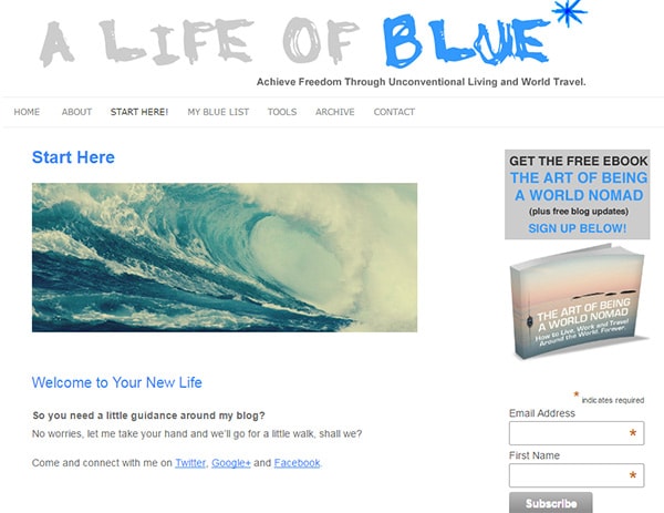
The start here page for A Life of Blue talks about travel and living with a nomadic lifestyle. These topics permeate most articles on the site, but some posts are more valuable to new visitors.
As you scroll down the page you’ll notice a sub-heading labeled “What should I read first?”
This is a beacon for new visitors who might be asking themselves this very question. It has a list of 10 popular posts related to travel and living free outside any specific lifestyle.
Other links point towards a free e-book and the site’s category archives. These are all valuable to new visitors but a list of recommended posts is the best place to start.
Another example I really like is the start here page for Hilah Cooking. While it does have a brief intro it also has many recommended links broken up into sections.
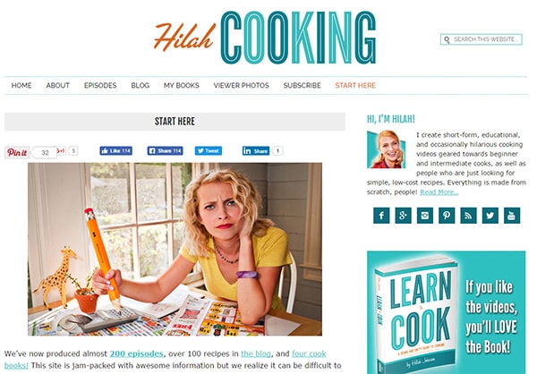
These aren’t just links cherry picked at random. They’re detailed recipe guides organized by preferences like basics, American classics, and vegetarian meals.
Internet users are incredibly impatient and they want to move fast. Providing a list of links is great, but organizing them based on context is even better.
I also like how this page is relatively short. It keeps attention where it belongs and gets visitors moving into the site. This should be the goal of every start here page, and recommended reading links offer a method of further engagement & pageviews.
Use Creative Designs
Since the “start here” page is intended to capture attention it should be well-designed and easy to look at. Try to include photos, graphics, or even videos if you have the material.
If you’re running a simple blog you can get a lot more stylized with the design. For example take a peek at the “start here” page on the blog Life as a Strawberry.
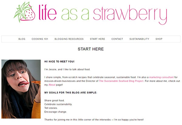
The writing is easy to read and the very first image is a personal photo of the site owner. The whole design feels easy to consume and whimsical.
But the rest of the page also uses images organized into a grid structure. This is popular with food bloggers because photos sell much better than words. In fact, many of the related links don’t even have link text. They’re just thumbnail photos of the recipes.
I don’t personally recommend going this far but you should try mixing things up. Add thumbnail photos to your link list to encourage clicks. Try structuring your page with different headlines and use photos/icons to spruce up the design.
Another incredible example is the Wellness Mama start here page. The page uses a custom header with a background photo and places tons of photos & icons throughout the page.
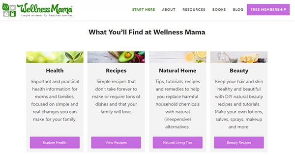
There’s a small category list of links with photos for each one. This makes it easy for new visitors to browse all posts for recipes, motherhood, and podcast episodes(among other categories).
Lower on the page you’ll find long lists of posts with thumbnails broken up by category(wellness, detox, DIY recipes, etc).
I think Wellness Mama does content right and really has the best-designed “start here” page I’ve seen. The color scheme works well, text is super easy to read and the photos add a certain livelihood to the page.
Try to create a design that feels alive while also keeping attention on the content. Even a very simple minimalist design can work as long as you’re helping new users get acquainted with the site.
Wrapping Up
As blogs and sites grow larger they become packed with great content. New visitors benefit the most from start here pages because these pages offer a mini tour guide for easing into the website.
But how you design this page is crucial to the user experience and how well the content is received. The tips in this post should help you build incredible start here pages that offer value to all readers and make your site much easier to navigate.